Mass Times
Redesign to help Catholics find Mass times and locations
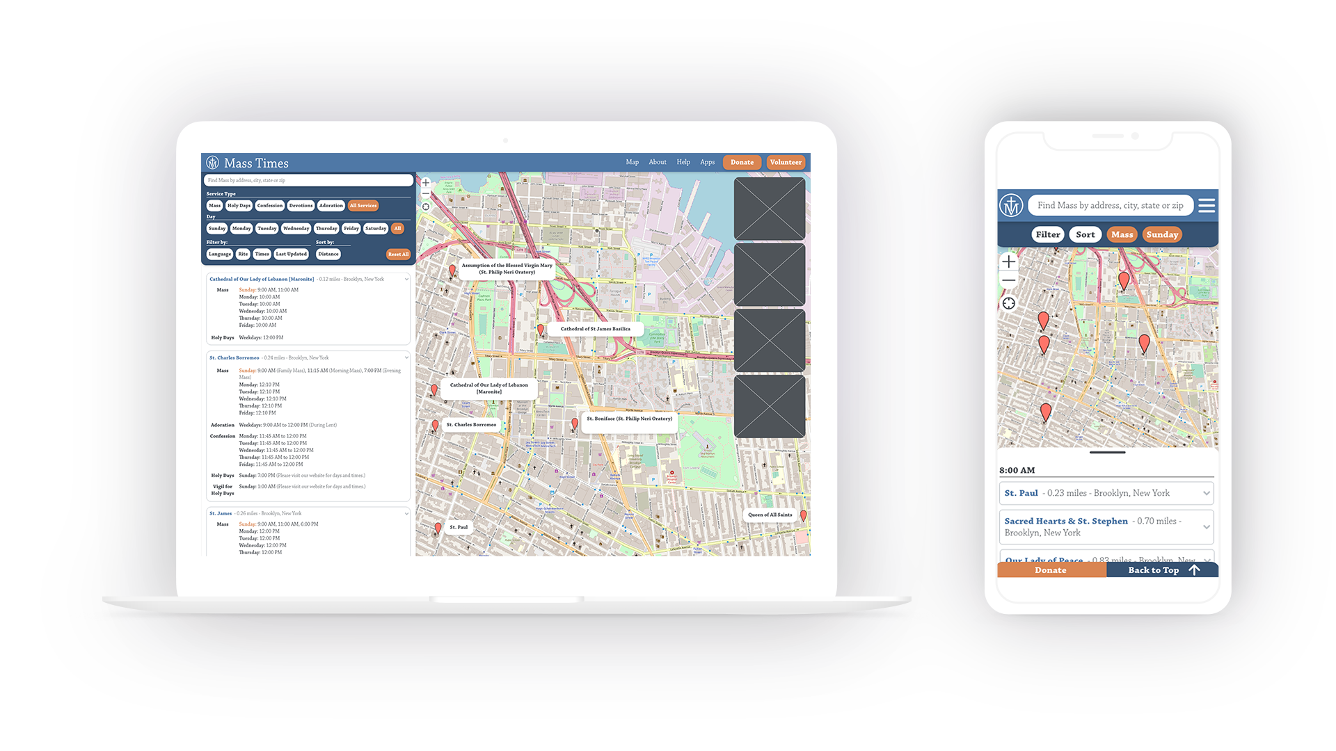
Overview
Mass Times helps Catholics find the times and locations of Masses and other worship services. They keep a crowdsourced database of parish info/schedules and are sustained by donations.
Problems
- Finding worship service times was time-consuming and difficult
- The accuracy of parish info was not trustworthy
- Users couldn't get a sense of the qualities of a parish before visiting
- The UI seemed unappealing and confusing at times
Solutions
- Additional options for filtering/sorting
- Channels for adding/updating parish information were made prominent and simple
- Tag-review system and photos in parish info pages
- Visual/UI design for currentness, clarity, and legibility
Research
I set out to validate my assumptions that the process of searching/sorting through results was lacking and that parish information was often dated/inaccurate.
Survey
A survey was sent out to gather information about site usage, users's experiences, and opinions.
Interviews
I learned the contexts and situations in which the site and its alternatives are used, and collected pain points in the search process on-site and off-site.
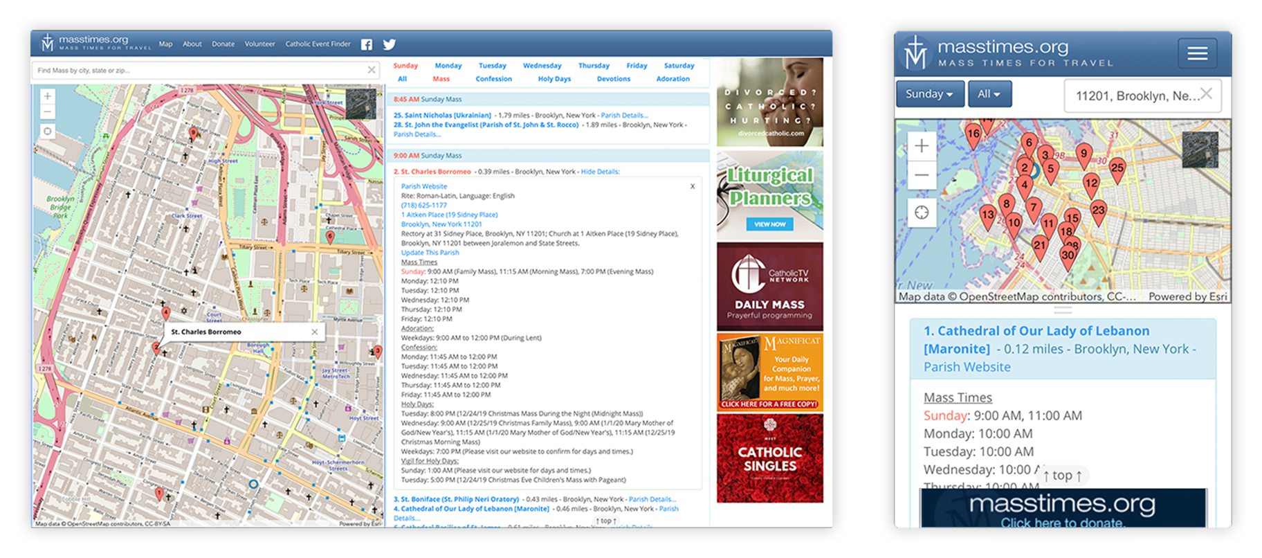
Pain points pertaining to Mass Times
- Lack of sorting/filtering options
- Results were hard to read and time-consuming to browse
- UI/visual design described as confusing, unpleasant, dated, or unfamiliar
- Info often missing/incorrect; users felt they had to verify accuracy
- No indication of last update to info
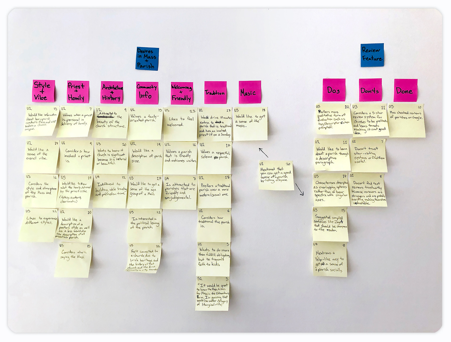
General Pain Points
- Limited ways to get a better sense of what a parish was like
- Difficulty in finding parishes that match individual preferences
- Having a bad experience while visiting a parish
Personas & User Journeys
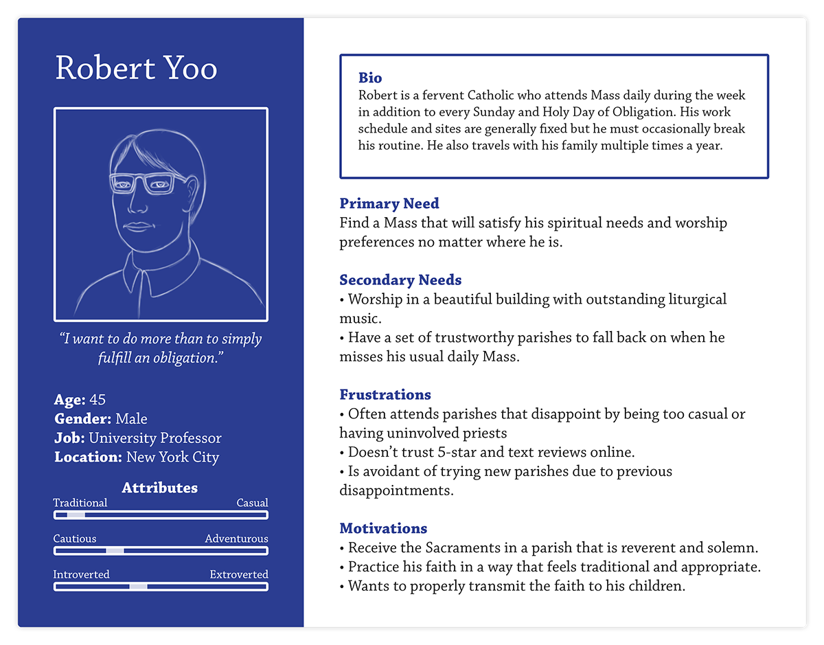
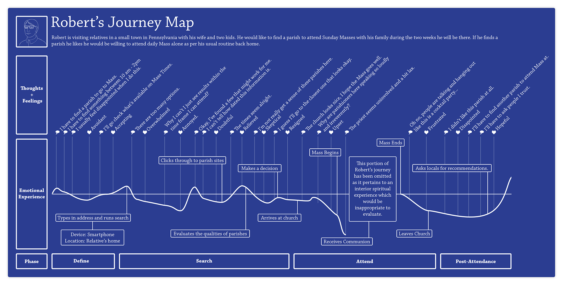
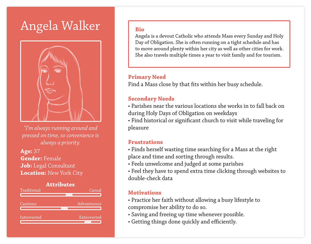
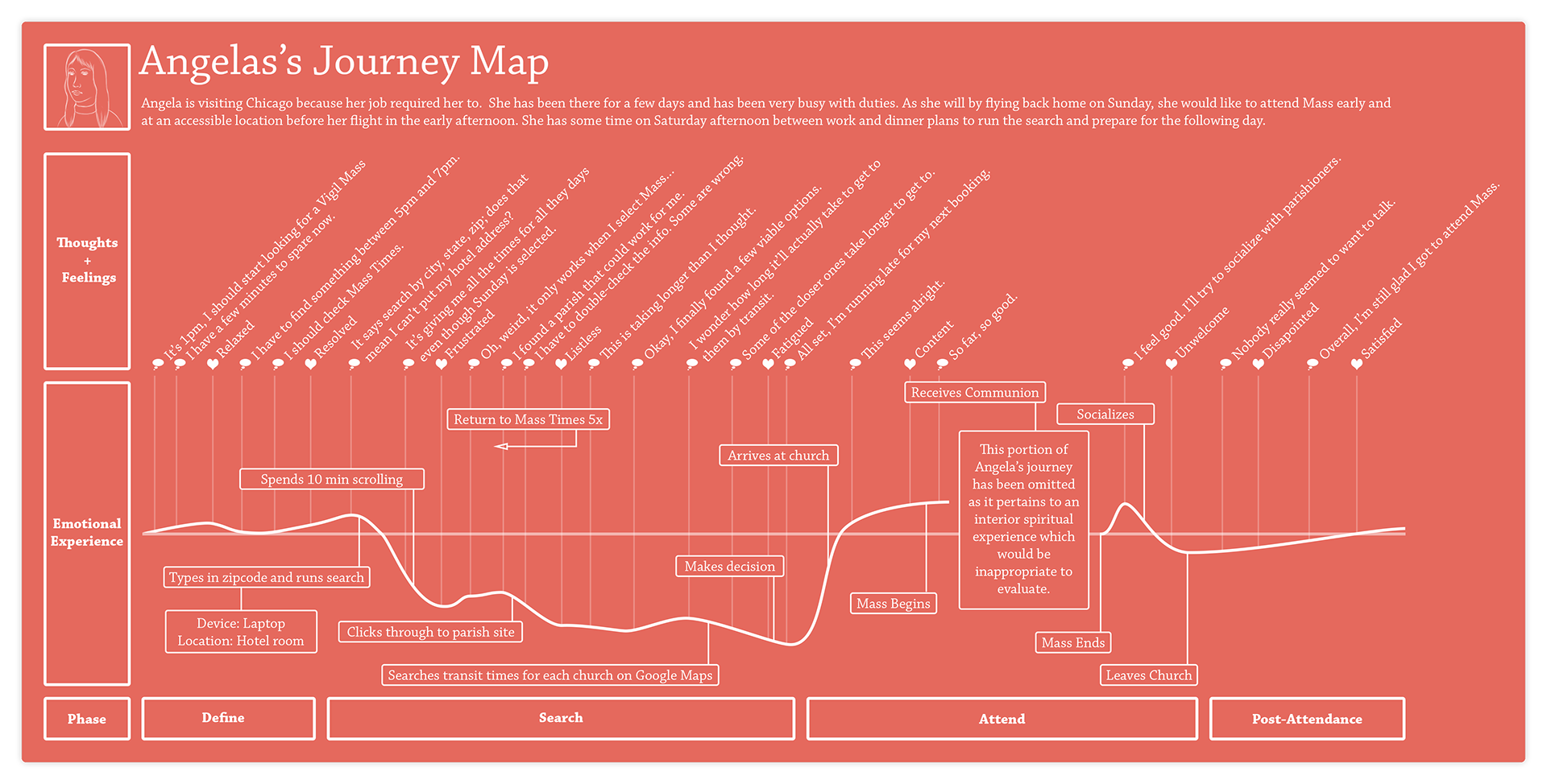
Two priorities emerged: the desire for specific qualities and convenience. These translated into distinct personas with respective journey maps.
Design
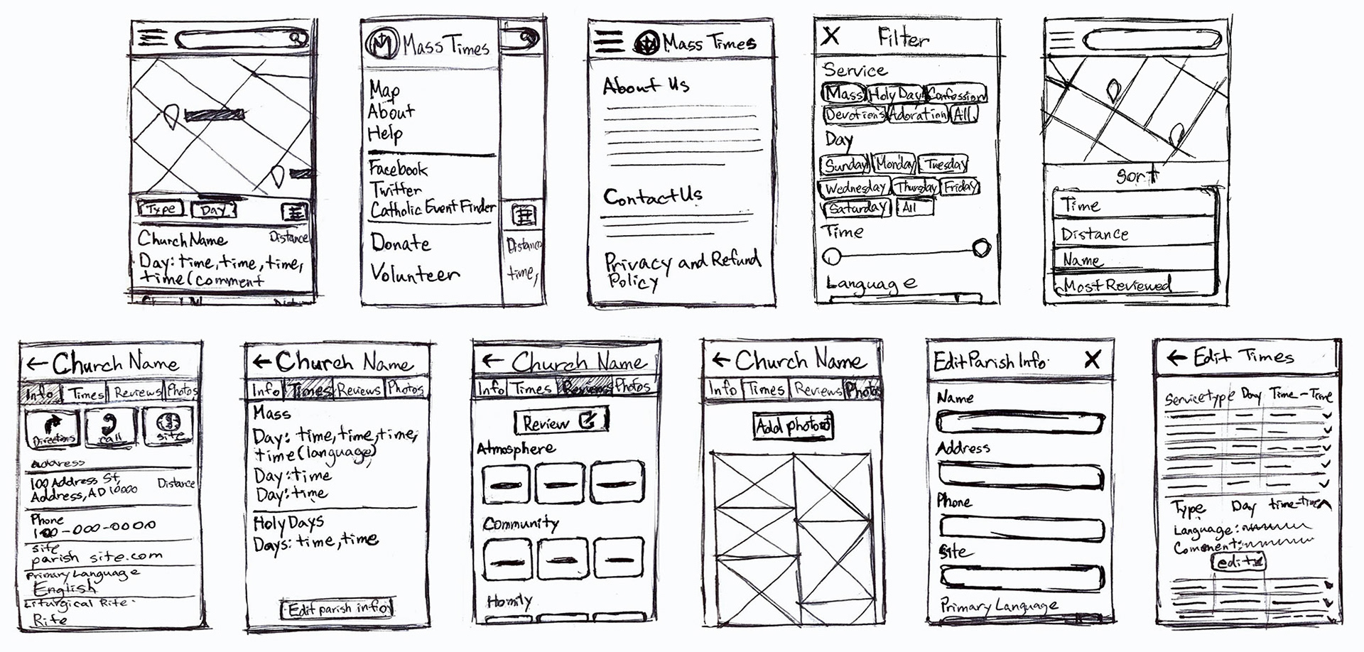
With user types in mind, I set out to optimize the site for convenience and to help users select a parish they would feel comfortable visiting.
Tag Reviews
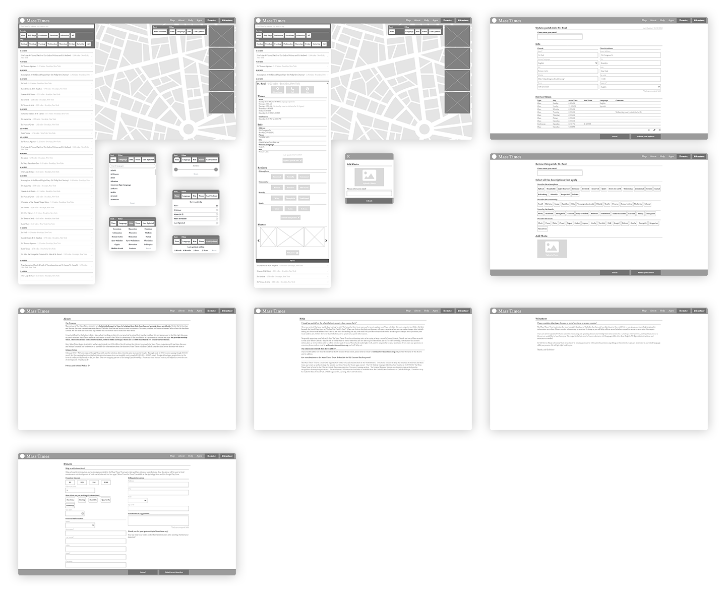
In line with user feedback, a review system employing preset tags was developed. These gave a qualitative overview of a parish with low abuse potential. (Inspired by Leafly.)

Wireframes & Prototypes


User Testing
User tests mostly revealed flaws in the desktop design, though both desktop and mobile versions suffered from lack of contrast and legibility.
Final Prototypes
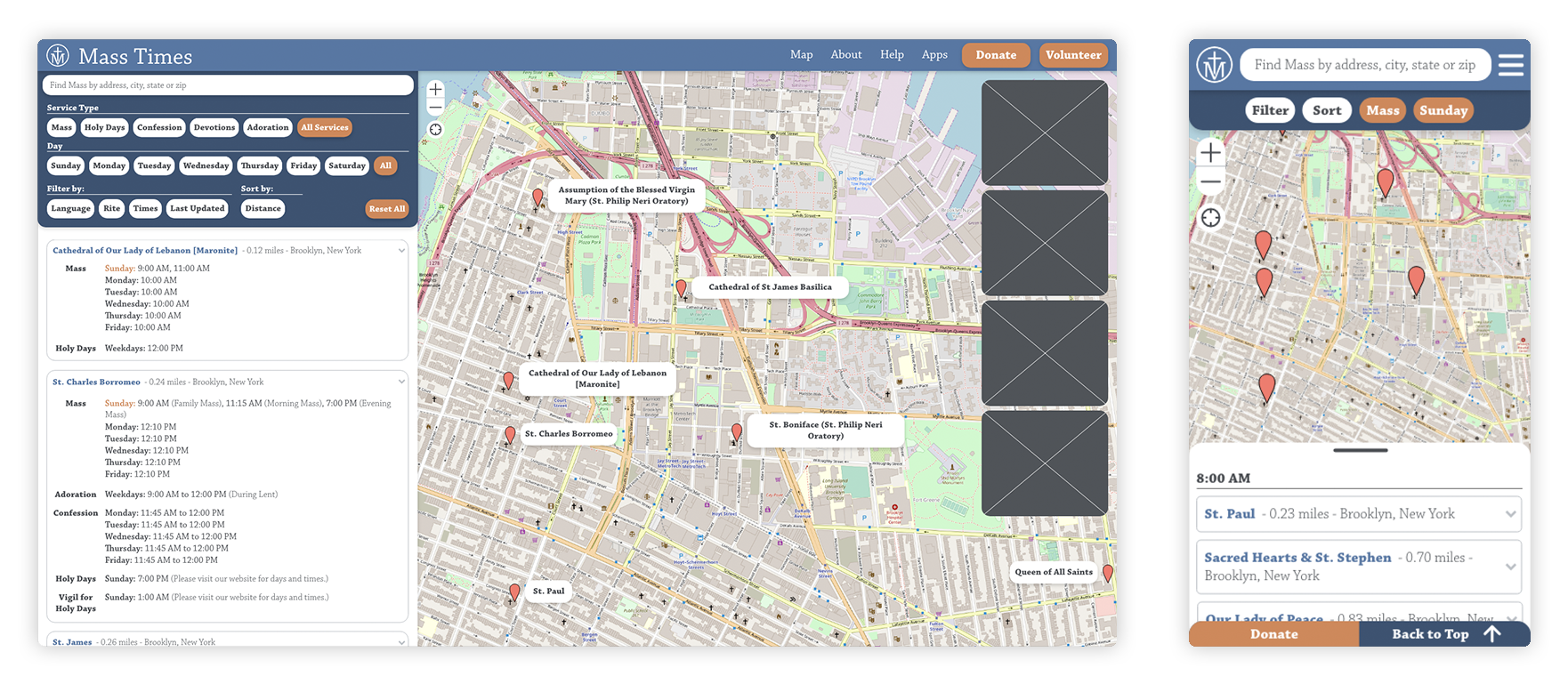
Notes on Visual Design
- Reflect a contemporary visual experience
- Logo, colors, and typography refreshed for currency
- Layout and visual hierarchy of results were modified for clarity and legibility
Final Thoughts
The design was shared with the Mass Times Trust, and they implemented aspects of it. If I had been able to test with a larger number of users, I would perform card sorting to refine the review tags.
↑ Back to Top