MSK Design System
Adaptable design system built for for healthcare consumers and staff alike
Overview
The MSK Design System was built to unify digital experiences across Memorial Sloan Kettering Cancer Center.
It serves two radically different audiences:
- Patients and caregivers navigating healthcare services
- Clinical staff who need dense, efficient interfaces
The system provides a shared foundation for designers and developers, ensuring consistency, adaptability, and long-term scalability.
Challenge
How do you create a single design system that works for:
- Consumer-facing apps that must be welcoming, accessible, and brand-aligned
- Professional clinical tools that demand density and precision
- Developers and designers across the organization using disparate components, styles, and processes
Solutions
- Headless architecture with semantic tokens for flexibility
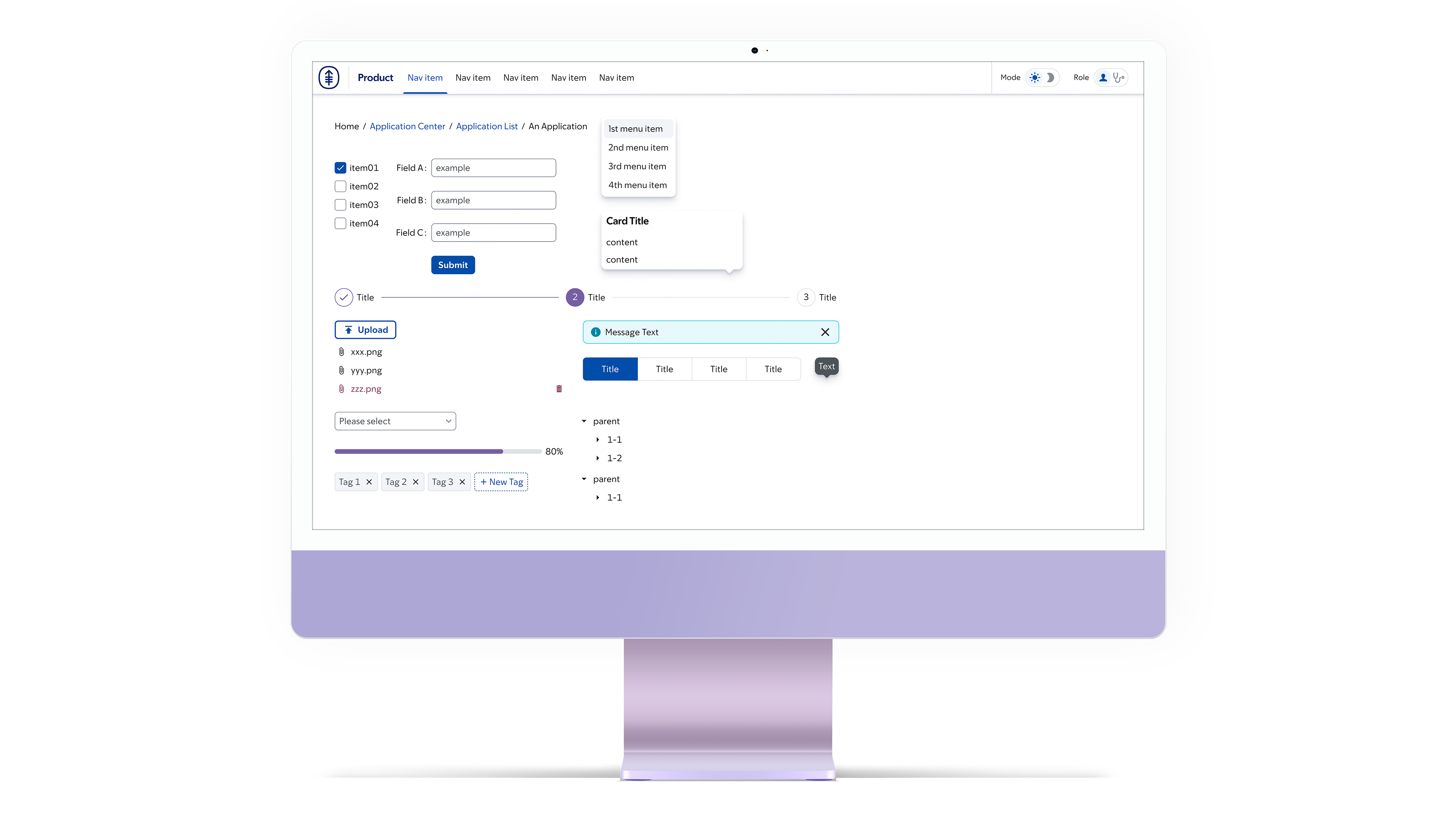
- Dual role-based modes: Consumer (patients) and Pro (staff)
- Custom typography and spacing strategies tuned to each mode
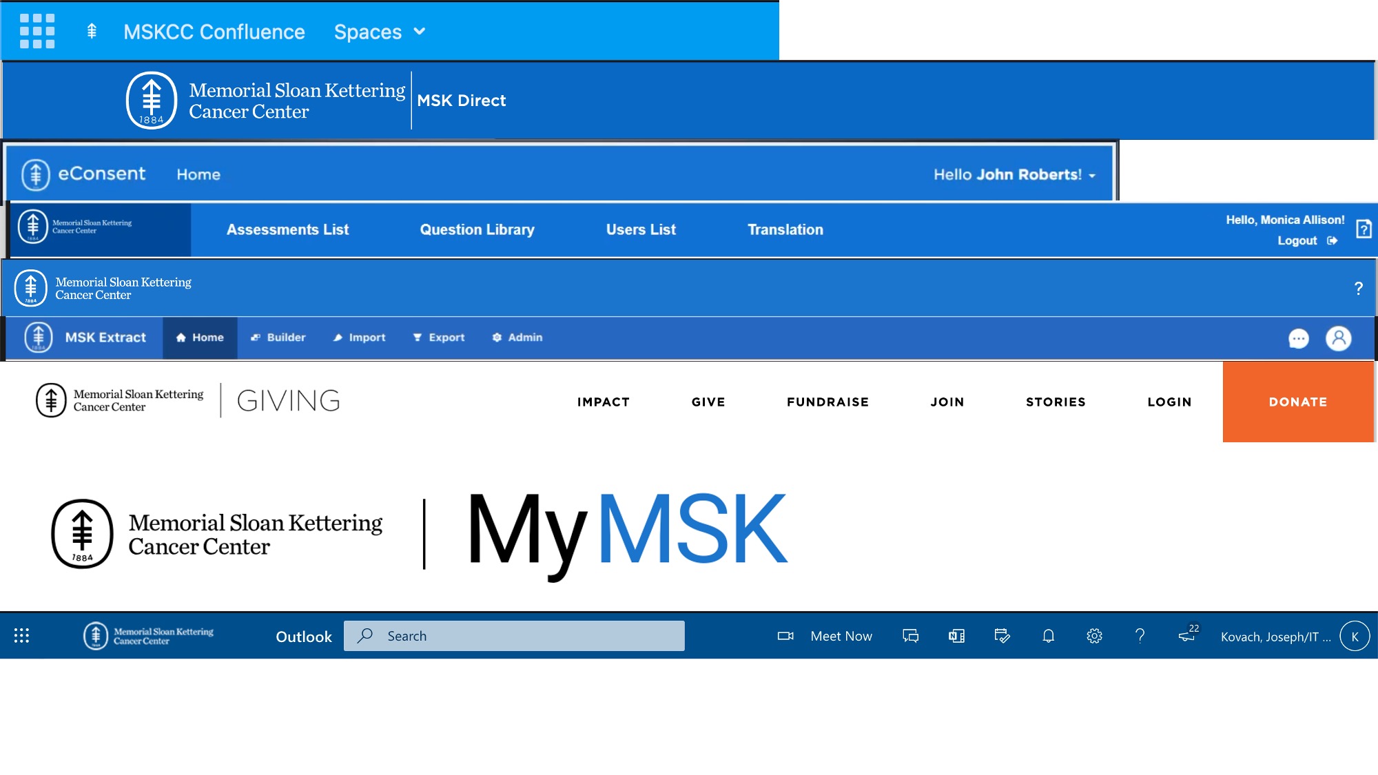
- Cross-technology compatibility (React/Ant Design, Gradio, Flutter, web)
- Accessible WCAG-Compliant designs incorporating proper sizing and contrast
Team: MSK Design System Team (within UX)
Early Days
In 2021, MSK's products were siloed and diverged in front-end solutions, mired in visual inconsistencies across the board.
We proceeded by customizing fork of IBM’s Carbon Design System (Figma + code). This involved the modification of foundational elements like colors and typography as well as the components.
While Carbon gave us a strong base, it quickly showed limitations:
- Large typography was effective for patient-facing apps but inefficient for staff tools
- Clinical apps required higher density to minimize scrolling and interaction costs
Our solution: a dual style strategy.
- Gotham → friendly, large-scale typography for consumer apps
- Source Sans Pro → compact, legible typeface for staff interfaces
Initial outcomes
The DS was adopted across multiple product teams with varying applications across the organization.
- 64%
- Efficiency gain
- 15
- Integrations
- 18
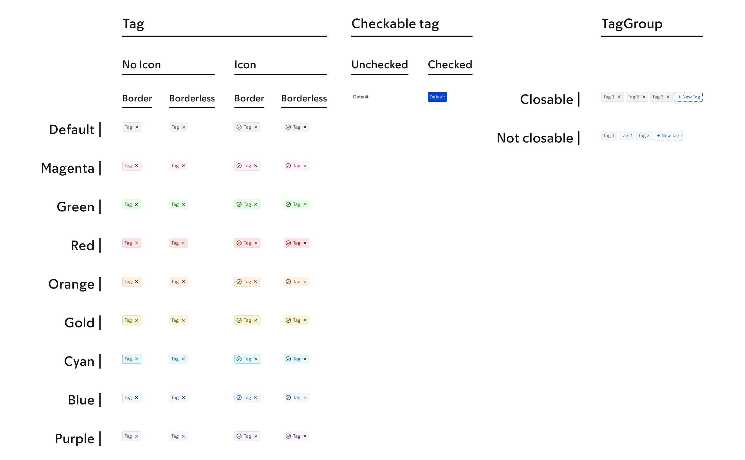
- Components
Tokens & Theming
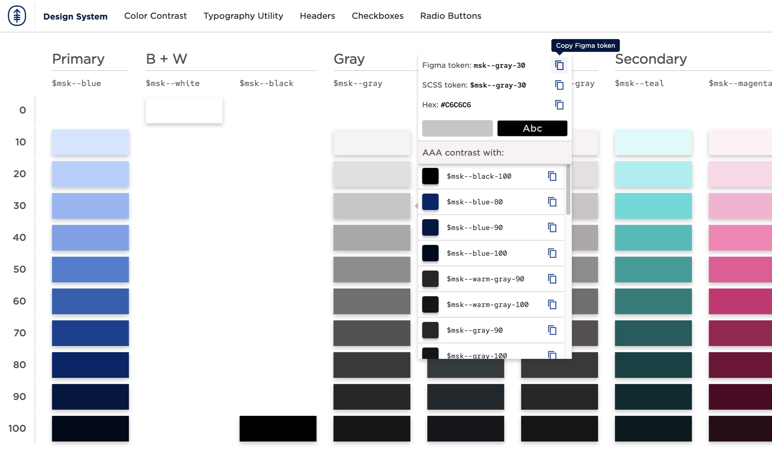
We introduced a semantic token taxonomy (color, and in later iterations, size, spacing, typography) enabling:
- Light & dark modes
- Consumer vs. Pro density adjustments
- Brand consistency across platforms
- The colors were checked for AAA contrast in light and dark modes
- The sizing of medium interactive items in Consumer had AAA touch targets while those in Pro had AA
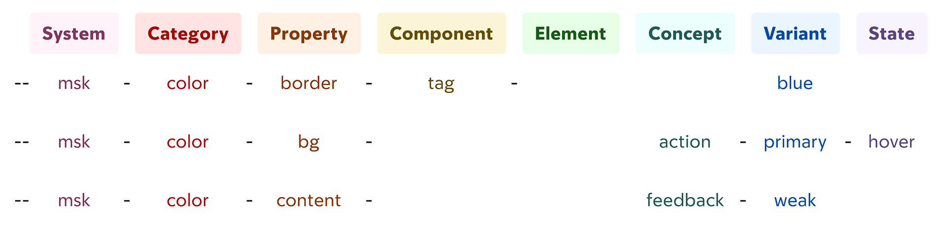
Tokens became the backbone for adaptability — a single source of truth powering multiple app families.
Headless Evolution
As adoption grew, we transitioned from a Carbon fork to a headless, MSK-owned system.
Key milestones:
- MSK Sans → proprietary typographic system (courtesy of the Brand team) balancing readability and brand
- Adaptive tokens → scale & spacing shift automatically by mode
- Mode-aware components → same codebase, optimized differently for each audience

This unlocked new flexibility: developers could build once, and the system adapted depending on whether the user was a patient or clinician.
Mode Toggle
The system supports seamless switching between:
- Light / Dark mode
- Consumer / Pro mode
Each configuration applies unique density, spacing, and typography rules.
Impact
- Adoption across teams: multiple product groups standardized on MSK DS
- Improved patient apps: approachable typography and layouts
- Developer velocity: design system improved consistency & speed without sacrificing visual consistency
What I’d Do Next
- Expand the library with domain-specific components
- Introduce UI components for AI-driven features