MSK Self-Scheduling
Replacing a costly, outdated third-party scheduling app with a native, multi-flow experience for patients, donors, and staff
Overview
MSK relied on a third-party scheduling platform that was expensive, visually dated, and difficult to use. I was brought on as the sole designer to replace it with a native web app — starting with a callback flow for new patients, and eventually expanding to cover blood donation, mammography, genetic counseling, vaccination appointments, and a provider browsing experience. Every flow was designed mobile-first and fully responsive, reflecting the reality that patients are often scheduling on their phones — in waiting rooms, at home, or on the way to an appointment.
The work spanned multiple years and user groups, and became one of the earliest adopters of the MSK Design System as it matured.
Challenge
- The existing tool looked and felt like something from a decade prior — patients and staff alike struggled with it, particularly on mobile
- MSK was paying significantly for a platform it had outgrown
- The scheduling entry point lived on mskcc.org, owned by a separate marketing department — meaning I couldn't own the full experience end-to-end
- Different appointment types came with very different business rules, audiences, and constraints
- New patient scheduling in oncology is inherently high-stakes: the flow had to balance clinical requirements with emotional sensitivity across screen sizes
My Role
I was the sole designer across all scheduling flows, working directly with a PM and engineering team under the supervision of a platform lead. I drove interaction design, visual design, research, and the design of supporting touchpoints like email confirmations and post-appointment feedback surveys.
Competitive Analysis
Before designing, I audited scheduling flows across healthcare systems and consumer health apps — including ZocDoc, Mayo Clinic, and others — to understand conventions, failure patterns, and opportunities.
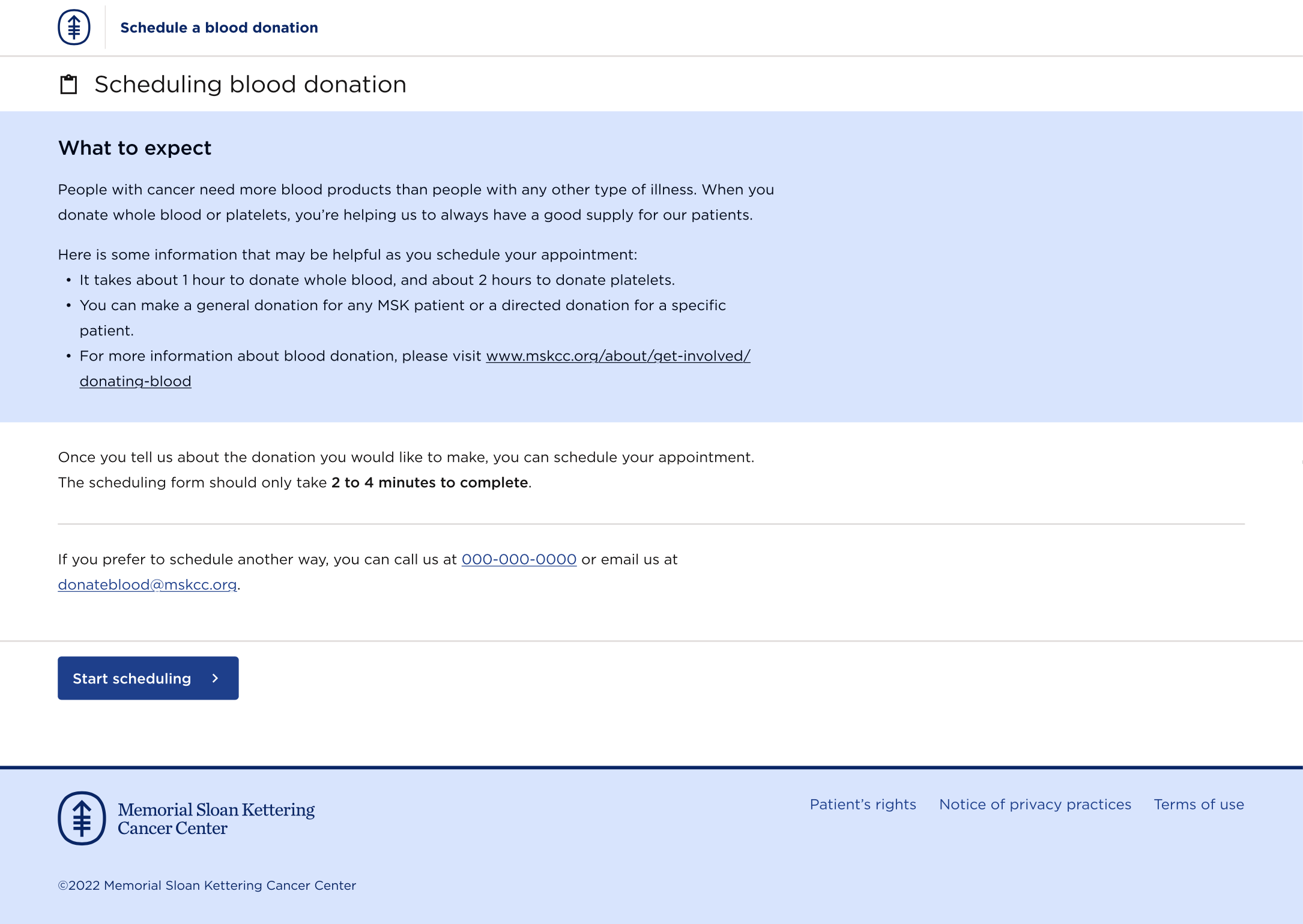
The analysis informed early decisions around step structure, form length, and how much information to surface before asking patients to commit to an action. Healthcare scheduling in particular tends toward either over-engineering (too many steps, too many rules surfaced too early) or under-explaining (leaving anxious patients without enough context). Finding the right balance was a through-line for the whole project.
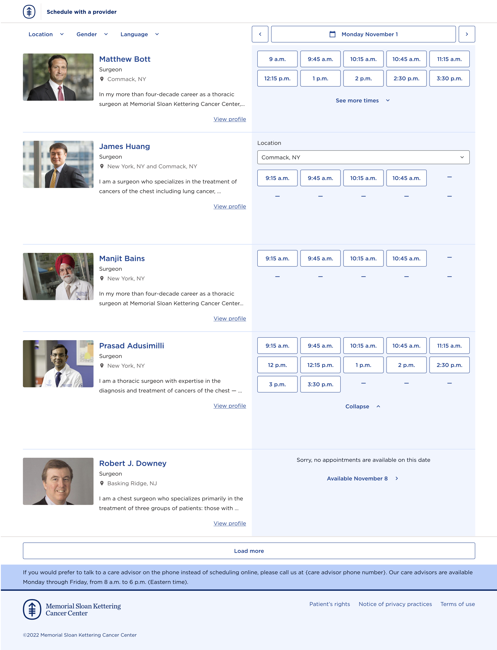
Starting Point: The Callback Flow
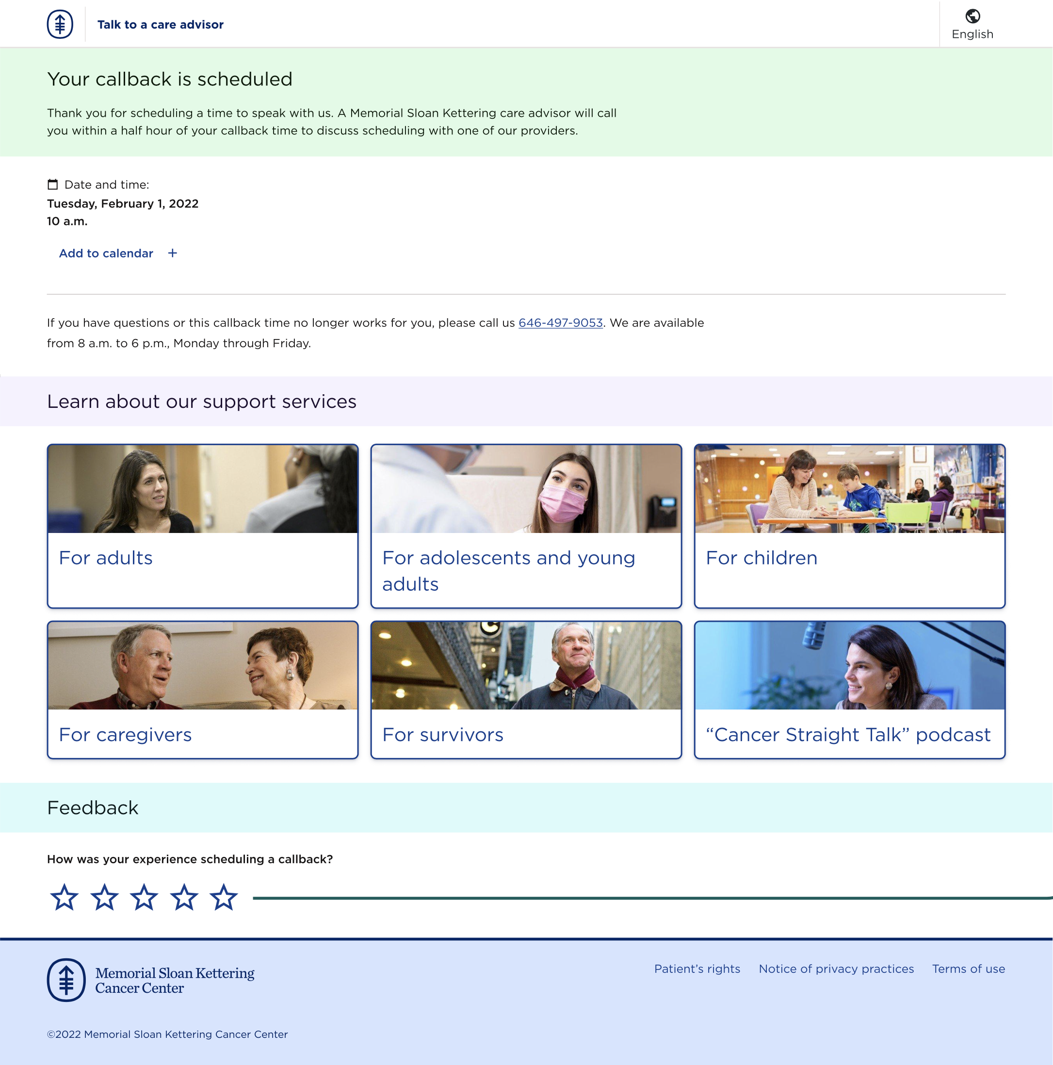
The first flow I designed was for new patients who needed to get in touch with a care advisor — the very first step in the patient journey at MSK.
The entry point was a form on mskcc.org (outside our control), which passed basic information into our scheduling app. From there, I owned everything: the handoff experience, the scheduling form itself, confirmation states, and the email confirmation that followed.
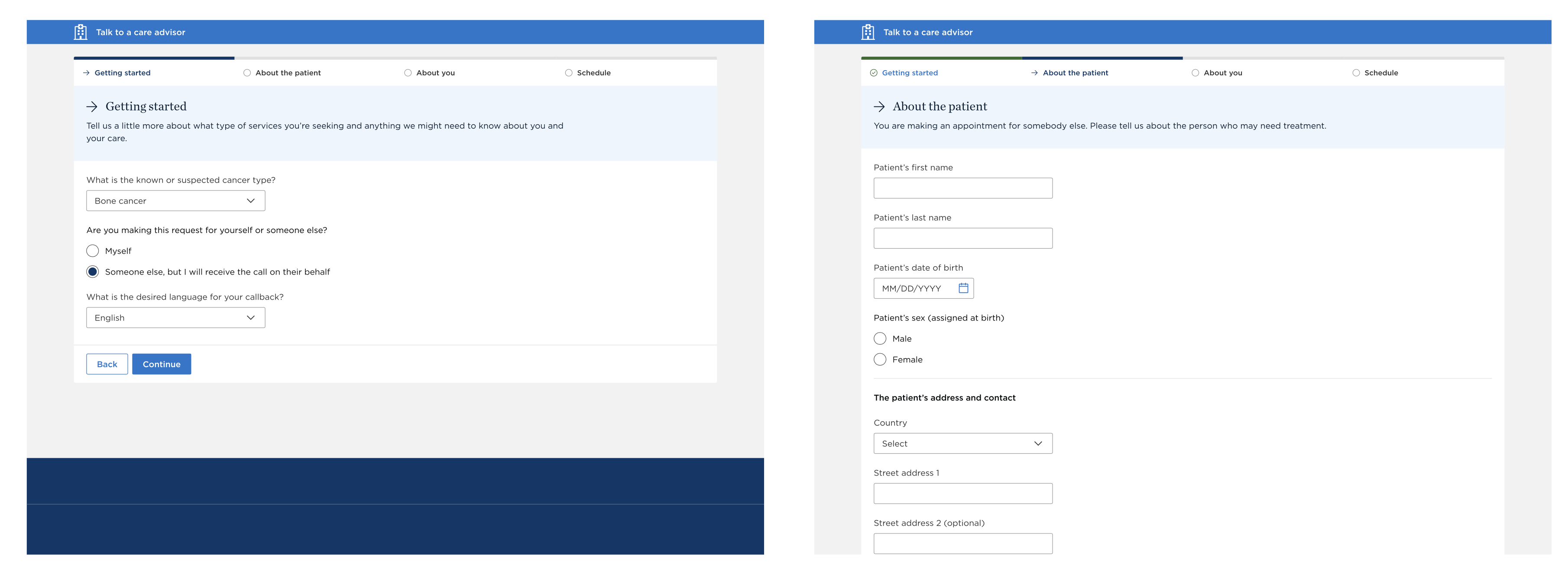
Before building, I explored whether there was an opportunity to fundamentally rethink the pre-patient journey with another designer. That direction didn't align with business priorities, so the focus remained on improving the existing flow rather than replacing it. That constraint turned out to be a useful one — it kept the work grounded in what could actually ship.
I tested the flow with PFACQ (Patient and Family Advisory Council for Quality) — a group of current and former MSK patients who advise on product quality. Their feedback was incorporated to improve clarity and ease of use, and overall response was positive.
The callback flow eventually got Spanish language support — an important consideration for MSK's diverse patient population in New York.
The success of this flow is what made the case for expanding the platform to other appointment types.
Click Testing & Research
At several points in the project I ran unmoderated click tests via UserZoom to understand how users navigated key screens and what they expected to find.
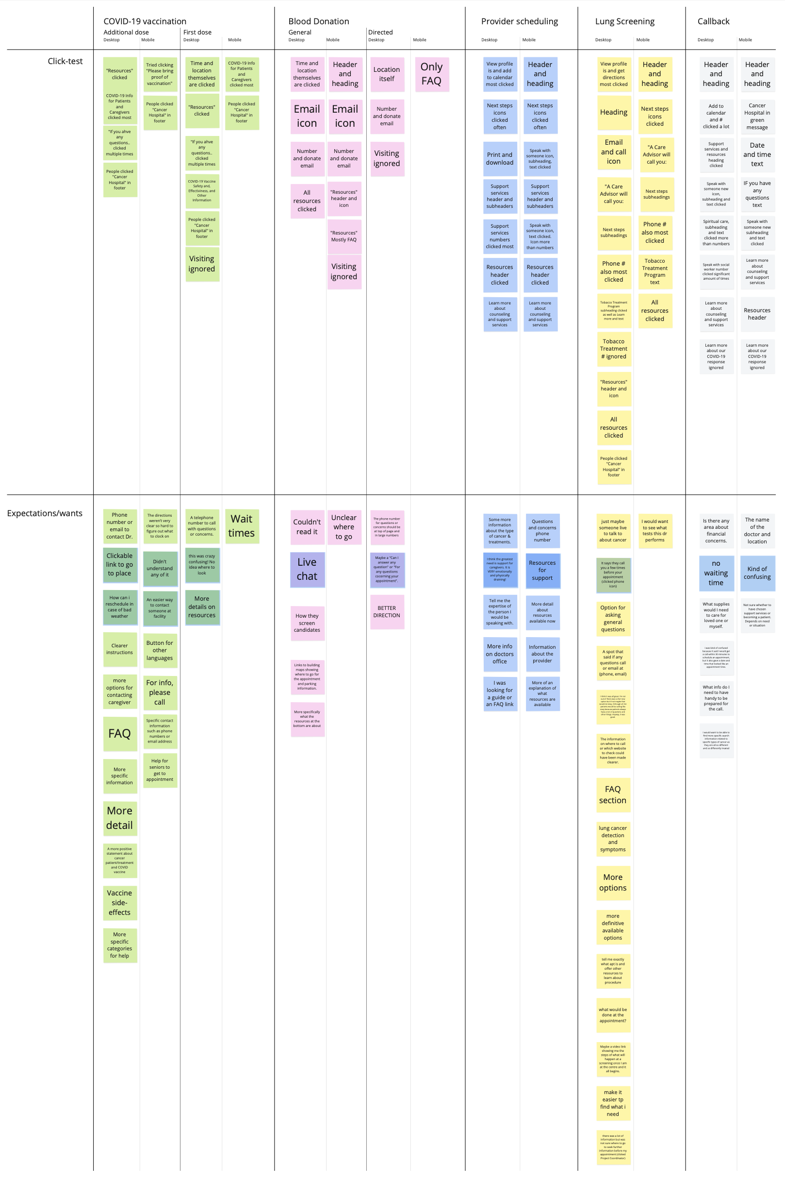
Across flows, the tests surfaced consistent patterns:
- Users gravitated toward headers, CTAs, and contact information — navigational and reassurance elements mattered most
- "Visiting" information was consistently ignored
- Users wanted more resources, clearer next steps, and direct contact options (phone, email)
- Blood donation users specifically wanted live chat and clearer direction on where to go
- Lung screening users wanted more information about what to expect and what the appointment would involve
These findings directly shaped the information architecture and content hierarchy across flows. One concrete outcome: I added a resources and support services section to the post-scheduling confirmation — surfacing contact options and support information at the moment patients had just committed to an appointment and were most likely to want them.
Design System Adoption
The earliest versions of this work predate the MSK Design System. As the DS matured, the scheduling app became one of the first products to adopt it — I led the reskin of existing flows to bring them into alignment with the new token architecture and component library.
This gave the scheduling app a visual coherence it hadn't had before, and validated the system in a real production context early in its rollout.
Expanding to New Flows
Following the callback launch, I designed scheduling flows for several other appointment types:
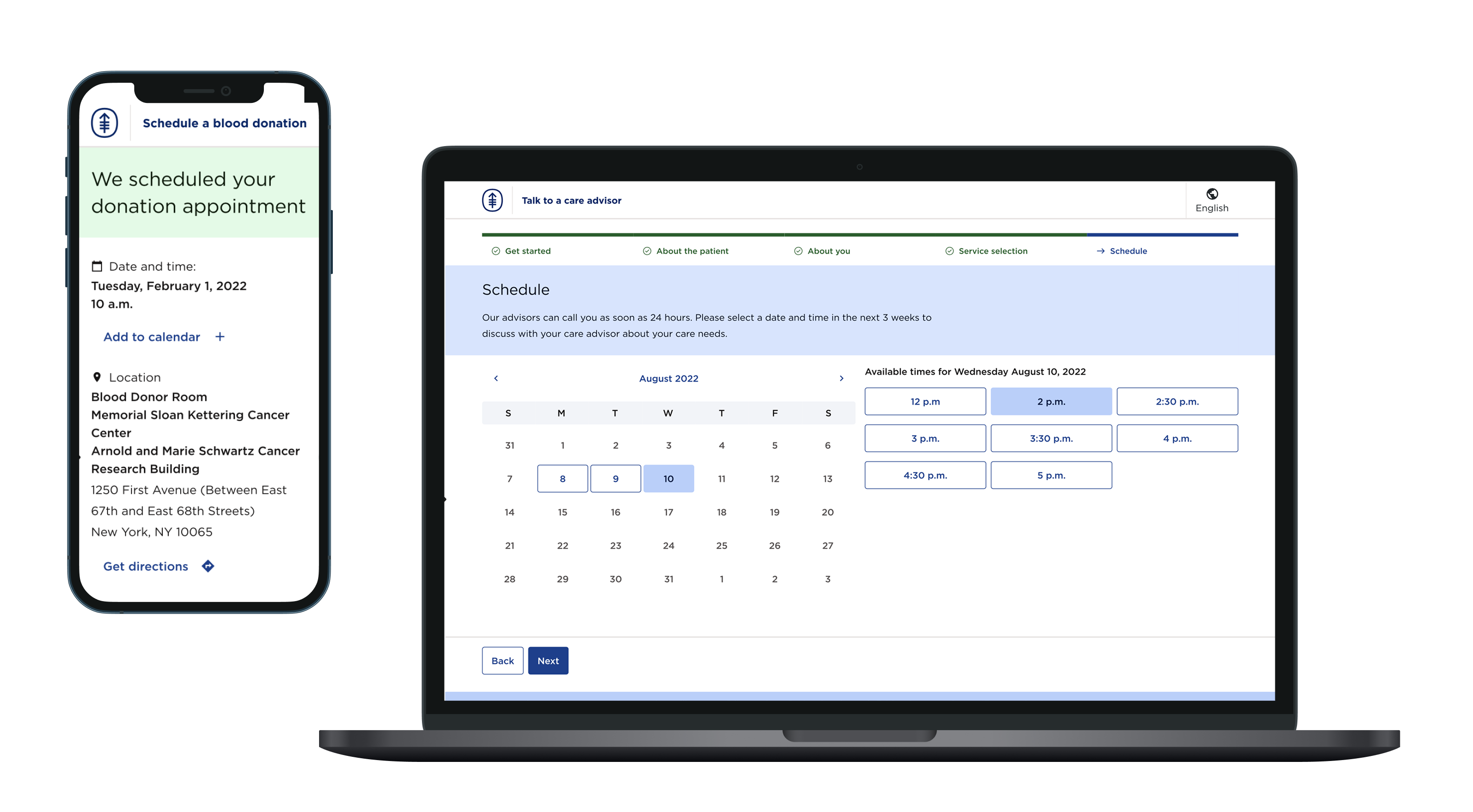
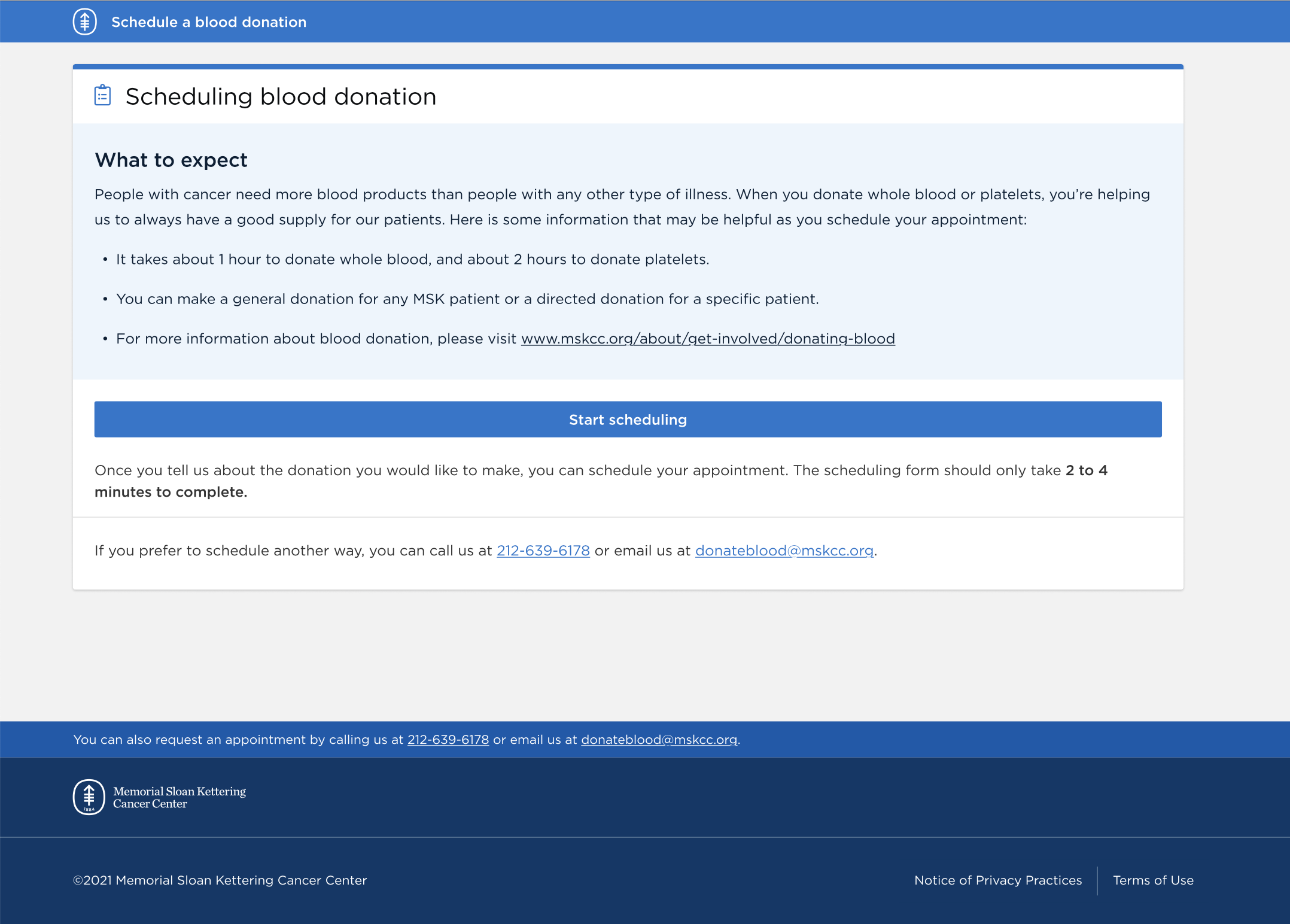
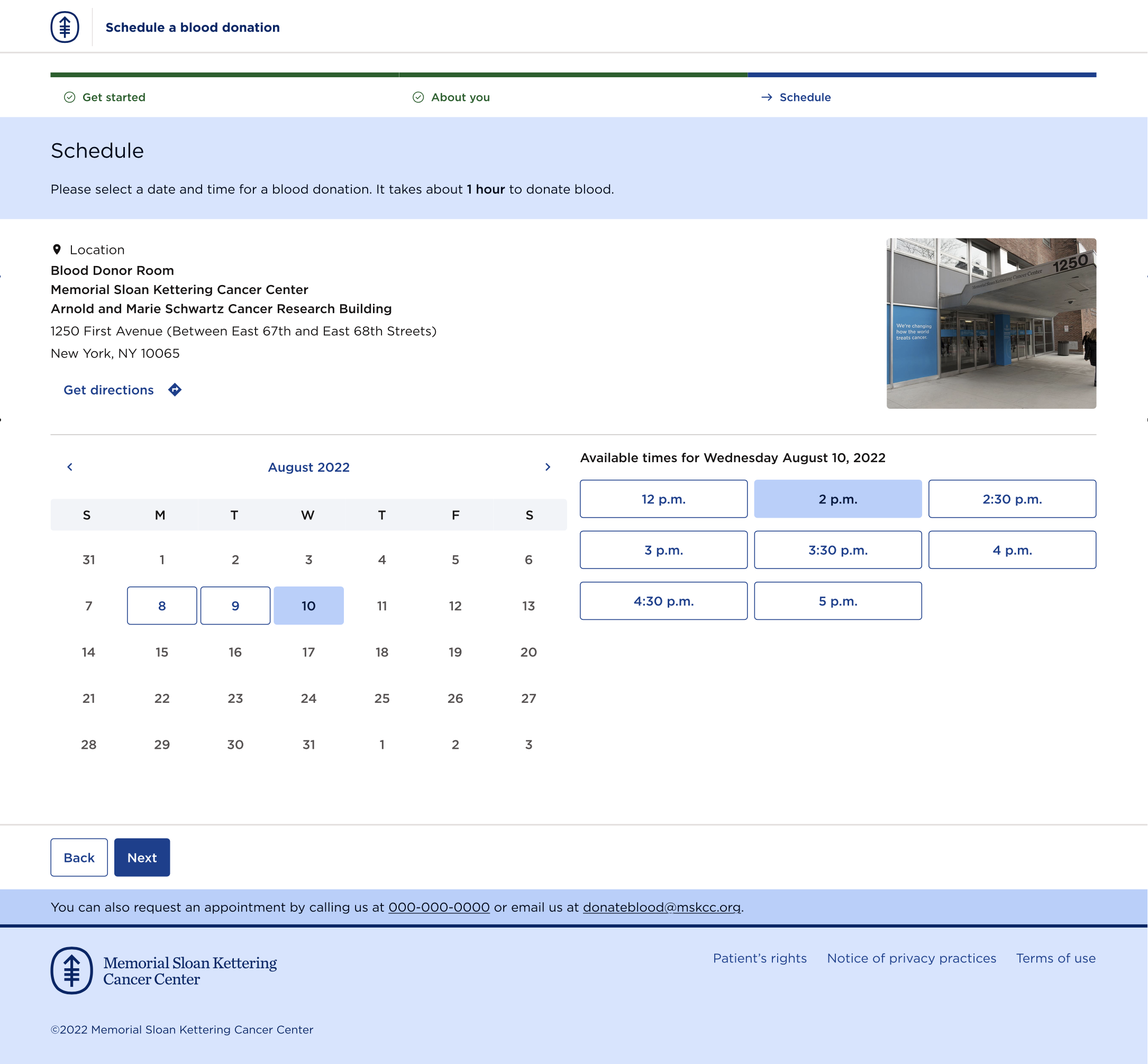
Blood Donation Open to everyone — patients, family members, and the general public. This one had personal resonance: I later learned that a friend's cousin was a patient at MSK, and that his family had been using the blood donation flow to arrange donations for him.
Mammography Scheduling
Genetic Counseling
Patient Financial Services Scheduling for patients who needed to speak with someone about the financial side of their care — a sensitive context that required the same clarity and reassurance as the clinical flows.
COVID-19 Vaccination Covering first and additional dose scheduling for patients, caregivers, and staff. The flow included a symptom screening gate — checking whether the user was currently COVID-symptomatic before allowing them to proceed — and location selection, since MSK operated multiple vaccination sites.
Each flow had its own audience, rules, and content requirements. Designing across them required careful attention to consistency without flattening the differences that actually mattered to users.
Provider Scheduling (ZocDoc-Style)
At one point we designed a more ambitious flow: a provider browsing and direct-scheduling experience modeled loosely on ZocDoc, where new patients could search for a doctor and book an appointment without a phone call.
The design was well-received and tested via unmoderated UserZoom studies. But it ultimately failed in execution — not because of the design, but because oncology scheduling carries strict clinical rules. Only patients meeting very specific conditions could complete the flow, and drop-off rates were too high to justify it.
This was a useful lesson in the limits of design in a highly regulated clinical context. The right experience couldn't be built on top of business logic that wasn't ready to support it.
We applied a similar approach to a lung cancer screening scheduling flow, which had fewer clinical constraints.
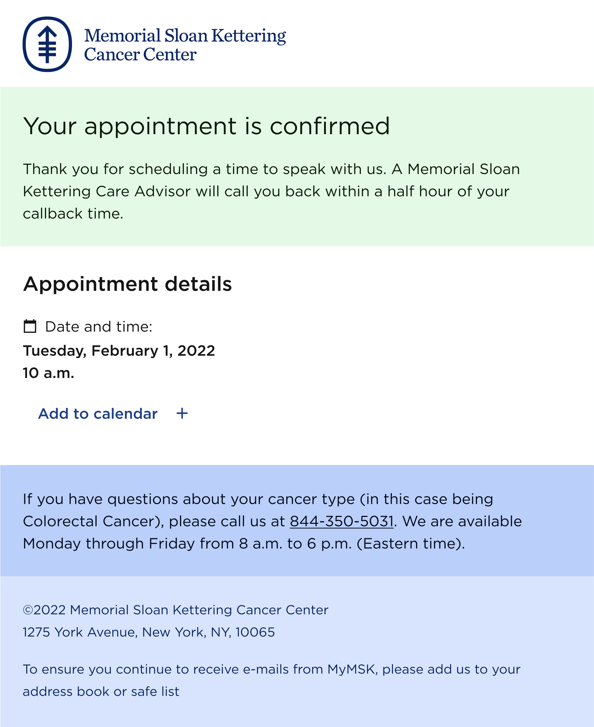
Email Confirmations
I designed email confirmations for each scheduling flow — a touchpoint that often gets treated as an afterthought. In a healthcare context, the confirmation email is frequently the thing patients screenshot, forward to family, or return to when they're anxious. Getting it right mattered.
Feedback Surveys
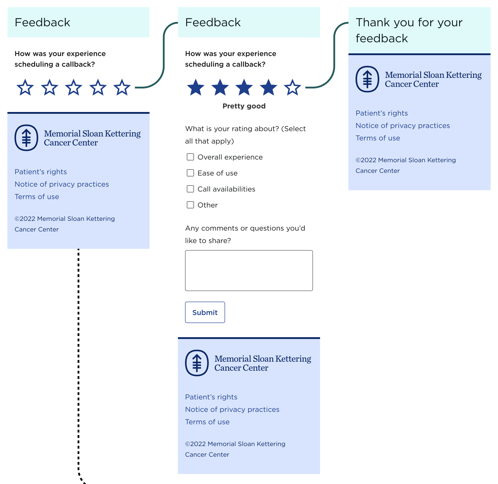
Post-scheduling feedback surveys were added to several flows, giving MSK a mechanism to hear directly from patients about their experience. I designed the survey touchpoints as part of the scheduling flow itself.
Impact
Precise metrics weren't captured for this project, but the outcomes were meaningful:
- The callback flow shipped and performed well enough to justify expanding to additional appointment types
- MSK replaced a costly third-party platform with a native, maintainable product
- The experience was substantially more usable and visually aligned with MSK's brand
- PFACQ testing and UserZoom research were incorporated across multiple iterations
- The scheduling app became an early design system adopter, helping validate the system at scale
Reflection
This project taught me a lot about designing within institutional constraints — an entry point I couldn't own, clinical rules I couldn't change, and a patient population where getting something wrong isn't just a UX failure. The most important thing I learned was that research done early and often, even lightweight click tests, consistently surfaced things that weren't visible from inside the team. And that sometimes the right design doesn't ship — not because it wasn't good, but because the systems around it weren't ready.